UX/UI | Growth Case Study
– Lost Bear Gallery
Boosting Art Sales & Connecting with Art Lovers: A Versatile, Minimalistic & Self-Managed Website for Lost Bear Gallery
My Role
Solo UX/UI Designer
Year (s)
2022 - Sydney, Australia.
Tools
Figma, WordPress, Woocommerce + plugins, Elementor & Adobe Creative.
Website
lostbeargallery.com.au
Overview
Lost Bear Gallery is a leading destination for contemporary art in the Blue Mountains, NSW, with a superb collection of paintings, sculptures, ceramics and glass art by acclaimed Australian artists.
The gallery wanted us to build a website to promote its artists, exhibitions and events, connect with a wider audience, and function as an online shop to increase sales.
Outcome
Thanks to the self-managed and user-friendly website, Lost Bear Gallery can keep its content up-to-date easily and ensure a consistent and visually appealing experience for its users.
This has resulted in improved interactions with customers, making it easier for them to navigate the site and find the information or products they need without feeling overwhelmed.
During the first 10 months, Lost Bear Gallery’s website generated approximately A$7,000 in online sales. The gallery received more than 170 new submissions through various contact channels, including their contact form, product inquiry popup, and mailing list.
The Process
Understanding Lost Bear & Its end-users
Research Summary
We conducted UX research to gain insight into the needs of both business stakeholders and end-users that included: interviews with key stakeholders, such as the gallery owner, marketing manager, and sales manager; auditing direct and indirect competitors to identify the best practices and common design patterns; and identifying art collectors as the primary user persona.
Based on this research, I created a comprehensive list of goals, pain points, and behaviours of Lost Bear Gallery and its end-users as a guide for making design decisions for the project.
Research Results
The Business: Lost Bear Gallery
Goals
Promote artists, exhibitions and events self-managing the content.
Connect with a wider audience.
Increase the visibility of the gallery and build customer loyalty.
Improve the website's conversion rate for contact/enquiry submissions.
Increase sales through the online shop.
Provide a user-friendly shopping experience for art collectors
Pain Points
Limited time and resources to manage the website and online shop
Need to balance the need for promoting the gallery's artists and exhibitions with the need to sell artwork online
Difficulty in managing and organising the gallery's extensive collection of artworks
Need to ensure the authenticity and quality of artwork sold online
Need to compete with other art galleries and e-commerce websites
Difficulty in tracking and analysing the performance of the website and online shop
Behaviours
Regularly updates the website and online shop with new content, including artwork, exhibitions, and events
Keeps track of website traffic and sales performance
Responds promptly to customer inquiries and feedback
Monitors the latest design and marketing trends to stay up-to-date
Collaborates with artists and staff to curate and promote exhibitions and events
Research Results
The end-user: A trend-savvy art collector who enjoys staying up-to-date and shopping online
Goals
Discover new artists and artwork.
Stay up-to-date with exhibitions and events.
Discover new artists and artwork.
Easily browse and purchase artwork online.
Connect with art galleries and artists to learn more about the artwork and the artists themselves.
Be able to easily manage and track their art collection.
Pain Points
Feeling overwhelmed by the sheer volume of artwork available online.
Struggling to trust the authenticity of online artwork.
Feeling disorganised when it comes to managing and tracking their art collection.
Spending too much time trying to find new and interesting artists and artwork.
Finding it difficult to keep track of all the different art galleries and online shops they visit.
Behaviours
Regularly searches for new and interesting artists and artwork online.
Visits art galleries and museums to see artwork in person before making a purchase.
Spends time researching artwork and artists before making a purchase.
Enjoys connecting with art galleries and artists to learn more about the artwork and the artists themselves.
Uses online platforms and apps to manage and track their art collection.
Values authenticity and originality in the artwork they collect.
Understanding information & System Requirements
Information Architecture (IA)
I used an object map in my design process to help me understand the website’s hierarchy and how the objects are related to each other and fit into the overall user experience.
This helped me to identify potential gaps, patterns or redundancies in the design and make informed decisions about how to design and build the system.
The Result
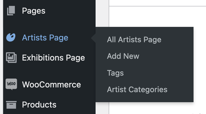
Customised WordPress backend + Dynamic Templates for Lost Bear
Adding the following specific features to the WordPress backend to better suit Lost Bear’s needs and requirements improved the overall user experience and made it easier for Lost Bear Gallery to manage and update the content.
1. Custom Posts.
Artist and Exhibition.
2. Custom Fields for the Custom Posts & Products.
Lost Bear can add even more information and details to their posts beyond the default fields that come with WordPress.
3. New Products
New Products under Artwork, Booklet, Greeting Card and Limited Edition Print categories
4. New Taxonomies
To help filter, link and classify the content.
5. Build Relationships
Between the different objects of the system.
6. Dynamic Custom Page Templates
Designed custom page templates with dynamic tags, giving Lost Bear more control over its website and enabling them to make modifications while maintaining consistency across all pages easily.
Dynamic tags offer a flexible and efficient way to manage content, reducing the time and effort required to make changes. This results in a better user experience, as the website’s design and functionality remain consistent and cohesive.
7. Woocommerce Integration
Lost Bear can easily access and manage product details, inventory levels, order status, shipping details, and customer information without the need to switch between different platforms or tools.
1. Custom Posts
Artist and Exhibition

2. Custom Fields
for the Custom Posts and Products
Lost Bear can add even more information and details to their posts beyond the default fields that come with WordPress.
3 & 4. New Taxonomies to help filter, link & classify the content
New Products under Artwork, Booklet, Greeting Card and Limited Edition Print categories.
5 & 6. How the dynamic Page Template works
By incorporating some filters and dynamic tags to the artist page template. The page pull and showcase the personalised content.
and a minimalistic & visually consistent space for discovering new artists & artwork for the end-user
I used an object map in my design process to help me understand the website’s hierarchy and how the objects are related to each other and fit into the overall user experience.
This helped me to identify potential gaps, patterns or redundancies in the design and make informed decisions about how to design and build the system.
Users can easily browse & purchase artwork online and make enquiries
I customized the product templates to ensure our users have a consistent and engaging experience navigating the website. By designing these templates, I aligned the shop pages with the overall look and feel of the site, making it easier for users to find what they need and make purchases confidently.
WooCommerce, on the other hand, offers numerous UX benefits, such as a straightforward and intuitive checkout process and multiple payment options.
Sold artwork
To prevent frustration, I implemented a widely used visual code: a red dot icon, indicating artwork that is no longer available for purchase. This common practice in the art gallery industry provides a clear visual cue for users.
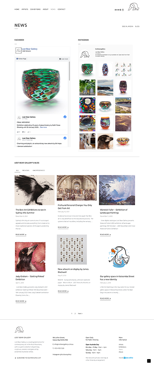
Allows users to stay up-to-date
with exhibitions & events
I made it easy for users to stay up-to-date with the gallery's latest exhibitions and events using a user-friendly interface similar to a magazine.
Users can also subscribe to the gallery's newsletter by clicking the designated link in the website's footer section.
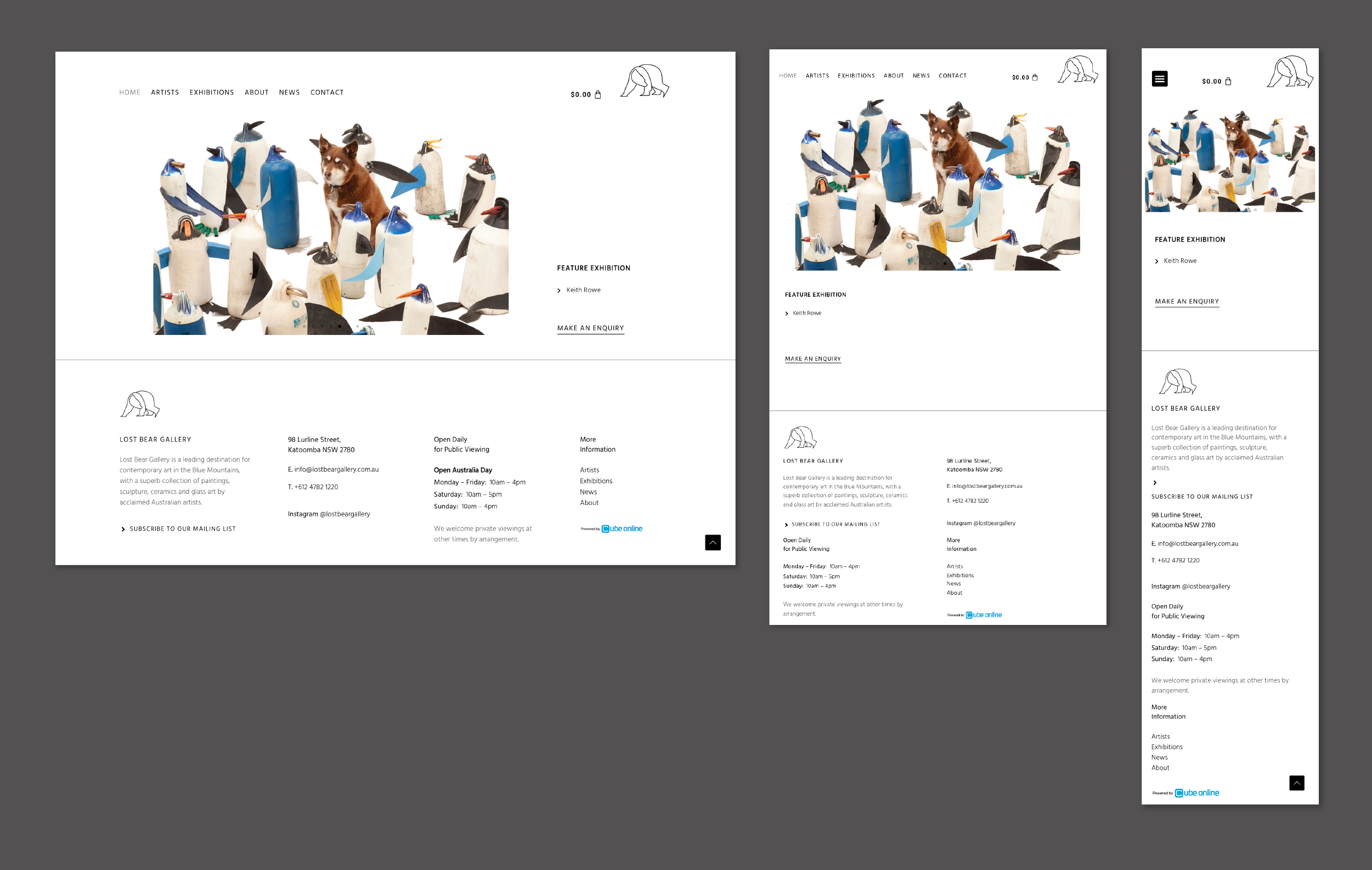
Responsive Design
The website is accessible and easy to use across different screen sizes and devices.

Website: lostbeargallery.com.au
UX Constraints faced & takeaways
I faced UX constraints while designing Lost Bear’s website. First, the client’s specifications were that the navigation menu could not include a separate “Shop” page. This meant that users had to purchase artwork through the exhibition or artist page, which required additional consideration in terms of how to present artwork and facilitate purchases effectively.
Another challenge was the loss of design control that came with making the website self-managed. While this enabled the client to add and update content without needing designers/developers, it required me to give up some level of control over the design and layout of the website. This meant I had to carefully consider creating a visually appealing and cohesive design that the client could easily update.
Working with a company with limited resources and time required me to adapt my design approach to fit their workflow. This involved prioritizing the most important features while finding innovative solutions to meet their requirements. Not all the accessibility features could be automated for content updating, such as alt text for images and keyboard navigation. Therefore, working closely with the client was crucial to ensure that all essential features were implemented correctly.
Despite the constraints, the website successfully sold over $7k worth of art within 10 months and received more than 170 new submissions through various contact channels. This demonstrated that by carefully balancing the UX constraints and finding creative solutions to meet the client’s needs, we were able to create a versatile, minimalistic and self-managed website for Lost Bear Gallery to connect with a wider audience and increase sales.


