UX/UI | Growth Case Study
– PINCHme
PINCHme connects consumers with brands by offering free product samples in exchange for feedback.
The user journey is simple:
1. Apply & Qualify
Users ‘Apply to Try’ samples & answer questions to determine eligibility.
2. Earn PINCHme Coins
By engaging with deals and activities.
3. Redeem for Delivery
Users need coins to cover the shipping cost of the sample box.
4. Provide Feedback
Users share their opinions to help brands improve.
The Problem
However, many users added samples to their boxes but but never finished checkout, leading to high abandonment rates, fewer conversions, and less valuable feedback for brands.
Research Insights
Surveys, social media listening, and user behaviour analysis revealed that the biggest blocker wasn’t just cart abandonment—it was procrastination in earning coins.
Since PINCHme Coins were required for shipping, users who delayed collecting them often abandoned their orders altogether.
User Pain Points
Lack of Urgency
No immediate reason to complete checkout.
Effort vs. Reward Disconnect
Earning coins felt like a chore rather than a rewarding experience.
Lack of Control
Users wanted more say over which samples they received.
Our Goal
To increase checkout completion, we needed to make earning and spending coins engaging, effortless, and rewarding.
As a UX/UI Designer at PINCHme, I focused on growth-driven design, rapid iteration, and data-driven decisions to enhance engagement, retention, and conversions:
Interaction & Experience Design
Implemented gamification strategies and designed a more intuitive and engaging checkout journey.
Rapid Iteration & A/B Testing
Experimented and refined user flows based on real insights.
Behaviour Analysis & Optimisation
Used surveys, analytics, and testing to guide decisions.
Cross-Functional Collaboration
Partnered with stakeholders, engineers, and marketing teams.
Scalable Design Systems
Built scalable UI components to support ongoing growth and iteration.
Within six months, our UX strategy led to significant shifts in user behaviour:
Gamification
To encourage users to actively earn and spend coins, we integrated game mechanics into the ‘Apply to Try’ and checkout flows.
Bidding System
Users could bid their coins on preferred samples, increasing their chances of receiving them and creating motivation to earn more.
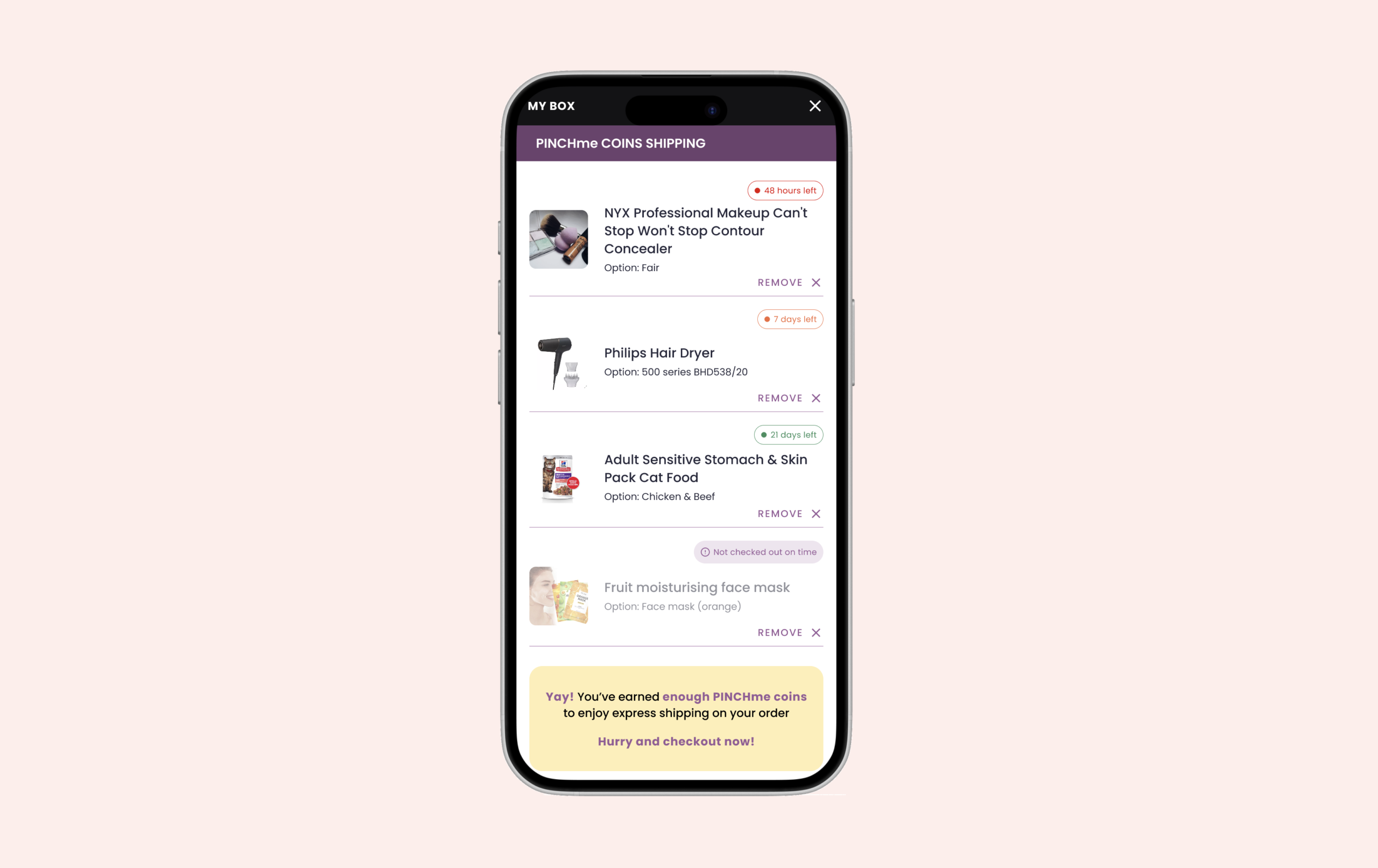
Urgency-Driven Elements
Countdown timers, exclusive samples, and limited-time offers triggered a fear of missing out (FOMO), motivating users to complete checkout faster.
Strategic Incentives
Pop-up offers and need-based deals made collecting coins simple, keeping users motivated and involved.
Benchmarking & Market Research
We analysed successful gamification strategies in non-sample-based platforms. This helped shape our approach, ensuring each feature had a clear purpose and impact.
More Control
Bidding let users influence sample selection rather than relying on luck.
Sense of Urgency
Time-sensitive elements encouraged immediate action.
Higher Coin Value Perception
Users saw coins as something worth earning.
Hypothesis
Goal
Empower users by allowing them to influence their sample selection, increasing motivation and interaction.
Impact
Users bid strategically, boosting engagement (+45%).
Experiment 1: Launched a Bidding System
We introduced a bidding system allowing users to bid coins on products they really wanted, increasing their chances of qualifying.
We integrated the bidding system into the ‘Apply to Try’ flow, allowing users to bid immediately after applying—without disrupting their journey, maintaining a natural and seamless experience.
Hypothesis
Goal
Reduce checkout abandonment by making coin-earning activities feel effortless and rewarding.
Impact
Users became more proactive, leading to +27% coin earning and +19% 'Apply to Try' actions.
Experiment 1: Need-Based Coin Offers at Checkout
If users lacked coins, pop-ups appeared showing exactly how many were needed and providing an easy way to earn them, reducing procrastination.
Checkout flow
Hypothesis
Goal
Encourage faster decision-making by creating a sense of FOMO (Fear of Missing Out).
Impact
Faster decision-making led to +60% higher checkout completion.
Removed Minimum Bid Requirement
When we first launched the bidding system, users were still required to have 600 coins to ship their box, even after placing a bid. This created confusion and limited participation.
To encourage more engagement, we removed the minimum bid requirement, making it easier for users to participate without needing to meet the full coin threshold upfront.
Added a Bid Management Section
Initially, bidding was only available during the ‘Apply to Try’ flow, with no way for users to view or manage their bids afterward. This limited engagement and created a disconnected experience.
More Bidding Opportunities
This not only unlocked more bidding opportunities beyond the initial flow, but also gave users greater control, visibility, and flexibility—leading to increased engagement and better outcomes.
Suggested Bids
Originally, users had no guidance when placing bids — leading to uncertainty, underbidding, and missed opportunities. Through testing and user feedback, we introduced suggested bids to improve confidence and performance.